September 13th, 2016
Partfaliaz interview Véronique Vienne
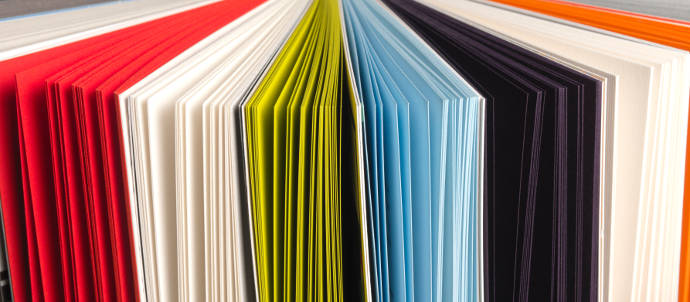
“Unlike the screen, paper reflects natural light. This quality seems to encourage people to “reflect” on what’s printed on it.”
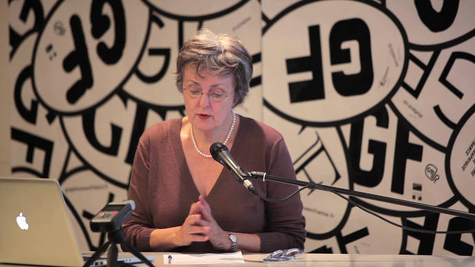
Véronique Vienne is a versatile personality with an incredible experience about graphic design. She was art director in New-York city and San-Francisco during about 40 years for prestigious magazines and agencies.
Then she began to write to better analyze and understand the work of the graphic designers, illustrators and photographers who collaborated with her. She writes books and conducts workshops on design criticism as a creative tool.
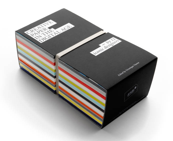
Today she is the editor of the amazing “Book of 12”, for that she conducted 12 interviews of 12 icons of international graphic design gathered into 12 original notebooks. Gathering information like:
- Is paper still part of the creative process?
- Is it possible to reconcile the instantaneous nature of electronic media with the slower but almost sensual process of choosing a typeface or a printing or production technique?
- How can the role of paper be evaluated in terms of effectiveness in communicating a concept, an idea or a message?
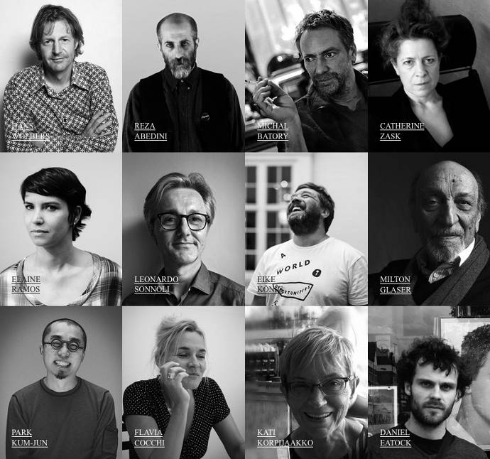
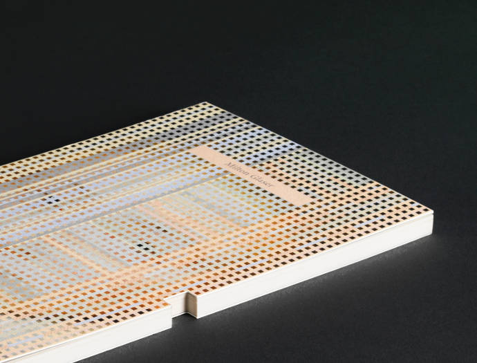
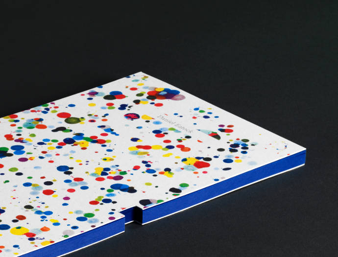
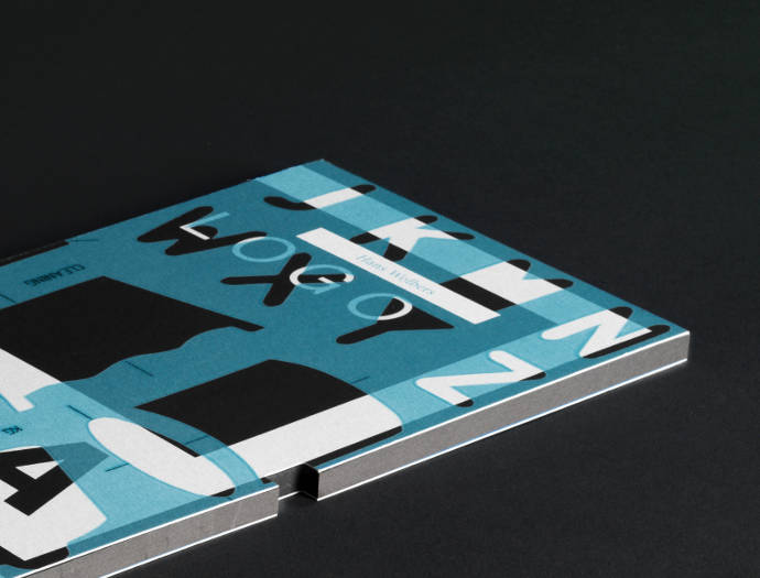
The designers Véronique Vienne interviewed are: Hans Wolkers, Reza Abedini, Michal Batory, Catherine Zask, Elaine Ramos, Leonardo Sonnoli, Eike König, Milton Glaser, Park Kum-Jun, Flavia Cocchi, Kaija Korpijaakko, and Daniel Eatock.
Good morning Véronique, how did you process to create such a book, how did you pick up the designers you interviewed ?
I had just finished writing a book on careers in graphic design in the digital age, for which I had done about 30 interviews with designers, some famous and seasoned, others very young and less experienced. What had transpired from my conversations with them had been a sense that print media still had its place in the digital age, and that, in fact, it was making a comeback.
When I was approached by Antalis, the leading paper merchant in Europe, (via Bambuck, their advertising agency in Paris) to participate in an editorially driven promotional project called the “Book of 12″, I saw an opportunity to pursue this same investigation by interviewing designers worldwide, in as many cultural contexts as possible.
We decided to reach out for people in every continent — well almost. All designers I contacted were well established, famous even, many of them members of the prestigious AGI (Alliance Graphique Internationale), individuals whose work I truly admired.
Milton Glaser is certainly THE most famous american designer, how did you reach him? Is there any story you can tell us about him ?
When I called Milton Glaser, he was very sweet, but he said: “Look, Dear. Don’t ask me to do yet another paper promotion!” I tried to convince him that this was different, that it was not, in fact, a conventional paper promotion — but I couldn’t fool him. You can’t buy Milton Glaser! “Prove to me that it’s not yet another lame project with a thin content, and maybe we can talk,” he said. I felt that he had left the door open.
A couple of months later I called him back: “Give me another chance,” I pleaded. “I’ll come to New York just to see you. I’ll show you what I have in mind. Maybe I can interest you in the project, after all.” The key to my approach, I explained, was that all the interviews were candid, and designers got a chance to tell it like it is.
I went to New York, we had lunch, and he talked to me about his love of paper for hours.
I think the Book of 12 is a nice selection of designers, they are all respected personalities, from different countries, different cultures, and they have personal thoughts. From your perspective, what is their common denominator?
They all have talent, passion, experience and originality. But what they all shared with me was a deep knowledge of what it takes to really communicate with an audience. The process requires an ability to think strategically, but that’s only a part of it. Just as important is the mastering of the various crafts involved. That’s where paper comes in.
For most of them, paper is a media (for print), for others, like Daniel Eatock, it may be a building material. In the case of print, choice of the paper is done by anticipation and then it is used at the end of the creative process, in paper art the material is used since the beginning of the creation that may be a less rational choice. Do that two state of mind (rational/emotional) about paper were mentioned during your interviews?
For the majority of designers I interviewed, the choice of paper is at the heart of the creative process. For them, the tactile dimension of a message is critical. They consider that good design should “touch” you. It should awaken all your senses, sight being only one of them.
For the reader, the choice of paper is an indication of the intention of the designer. You can “read” the texture, the weight, the color, the size, even the sound that a piece of paper makes when you handle it. There is a lot of additional information there, some of it sensorial, some of it emotional, some of it cultural.
Paper is sensual, fragile and discreet. This maybe the contrary of digital world… However Hans Wolbers says that « Our web designers need paper to think, it is so much faster than digital tools. » Did you feel that trend with other designers ?
Paper is part of the creative process in a conceptual but also a practical way. At some point along the way, it’s not unusual for designers to feel the need to switch from the screen to paper, to get a new perspective on their work. They print the digital page to be able to see it in the right scale, or in the right light.
Or they pin on a wall a print version of their different design solutions, step back, squint, and compare them to each other.
Or, rather than send their clients a pdf of the latest version of their work in progress, they give them a set of printouts. Designs you can touch are so much more real and convincing than their dematerialized images.
Unlike the screen, paper reflects natural light. This quality seems to encourage people to “reflect” on what’s printed on it.
The youngest of your interviewed is 47 years old, that is obvious because they all are experimented and famous. But it is a generation who succeeded before the creation of Facebook, could you tell us how the digital age is represented in the « Book of 12 » ?
The Facebook generation is also the “notebook” generation! Along with a smartphone and a tablet, more and more of my friends and many of my students carry a little notebook on which to scribble their thoughts, sketch an idea, and write down a name or an address. Often these notebooks are personalized, handmade contraptions. They are the keepers of a person’s soul.
That’s why we chose to present the interviews as a series of separate notebooks rather than a conventional book. Each notebook has its own personality. We also wanted the pages to be glued together in such a way as to make tearing them easy and even pleasurable: you always want to be able to interact with a piece of paper.
According to you, what are the links between “digital design” and “traditional design”? Between digital and paper?
All designs end up being “framed”, whether by the edge of a screen or the edge of a piece of paper. Animations, however playful, are a succession of carefully framed rectangular images. You Watch 3D videos and play VR games inside the boxy confine of personal viewers. One way or another, when you design something, whether virtual or analog, you have to deal with its material and ergonomic dimensions.
So, to answer your question about the difference between digital and non-digital design, I would say it’s all the same thing. There is no real difference. In both instances, you cannot forget that end-users are human beings with physical attributes.
I discovered recently the work of Korean designer Park Kum-Jun, and if there is always a part of universality in every piece of design, I have to say I was amazed and lost by signs from a culture so far from mine. Were you surprised by some of the answers you collected, from Iran, Finland, Korea or elsewhere?
The trickiest part of this project was to convince the various designers that I was not asking them to endorse a product. Like Milton Glaser, they were not comfortable with the idea of participating in a promotion.
In the end, each designer had a different reason for talking to me. I had to be attentive to the cultural nuances: for some people, this project was a chance to reflect on the future of their profession, for others it was the pleasure of talking about their work — Park Kum Jun was among the most delightful and generous contributors — and for still others it was an opportunity to explain in great detail the intricacies of their creative process.
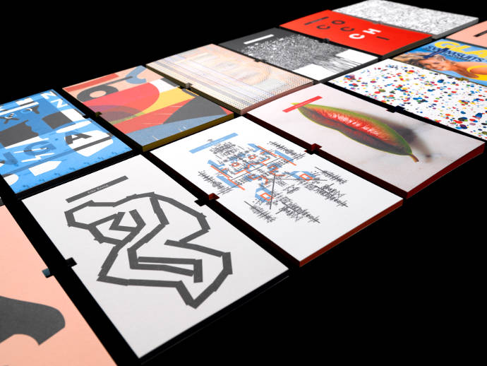
I gave designers total freedom in the choice of the visual for the cover of their notebook: they picked something they liked, or something original they designed for the occasion. In the end, each cover is like a personal manifesto.
Thanks a lot Véronique, now where can we get the « Book of 12 » ?
The Book of 12 is available in limited edition on the dedicated website bo12.com which goes live today, September 13th.